CSS: Flex-box property

P
I am front-end developer.
What is flex-box?
=> It makes, easier to design a flexible responsive layout without using positioning and float property.
=> Flexbox is one dimensional method.
=> It has powerful alignment capabilities.
The basic concept of flexbox:
There are two types of axes of flexbox
- Main axis
- Cross axis
Flexbox: To start using the flexbox property, first you need to define a flex container.
flex-container { display: flex; }
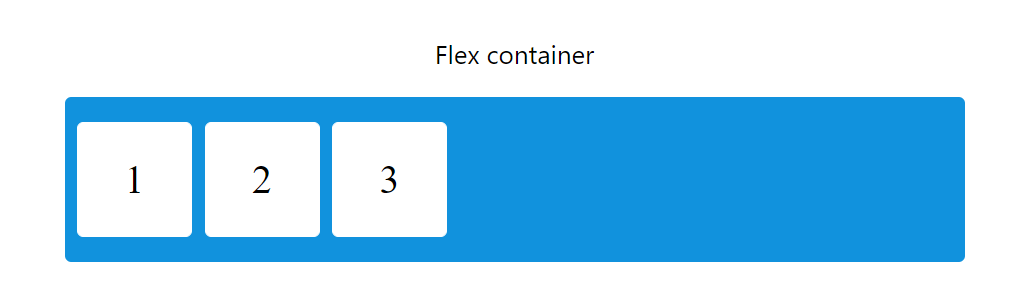
The flex container properties are
- flex-direction
- flex-wrap
- flex-flow
- justify-content
- align-items
- align-content
Different flexbox properties
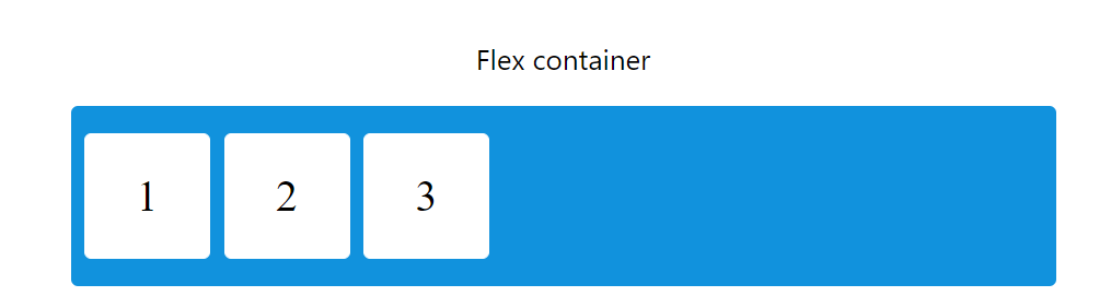
{
display: flex;
flex-direction: row;
}
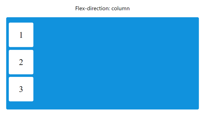
{
display: flex;
flex-direction: column;
}
{
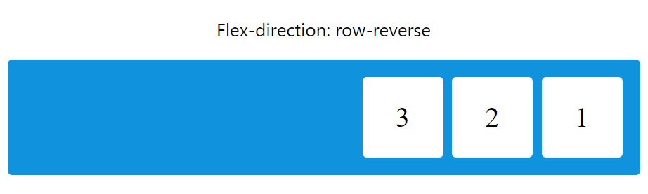
display: flex;
flex-direction: row-reverse;
}
{
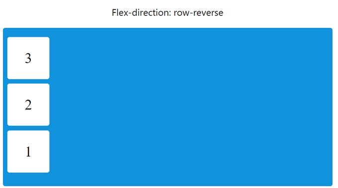
display: flex;
flex-direction: column-reverse;
}
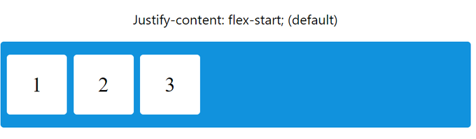
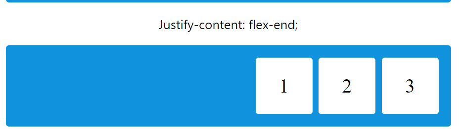
Justify-content property is used to align the flex items
{ display: flex; justify-content: center;
}

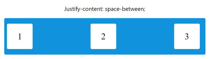
{ display: flex; justify-content: space-between;
}
{
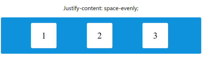
display: flex; justify-content: space-evenly;
}
{
display: flex; justify-content: flex-start;
}
{ display: flex; justify-content: flex-end; }
I'll cover the rest of the properties in the next article.
24 views